

BLOGFEST is a HTML responsive template built in special for blog and online magazines, but can fit a more wide business profiles. The template contain 17 pages, 4 home page variations, 3 layouts for portfolio or gallery section, along with the templates used for a blogging platform like WordPress (please keep in mind this is not a WordPress theme): single post page, category page and search results template.
Two kind of layouts for mobile and tablet devices
In a normal template usage, a sidebar contain a less important content (from mobile user point of view). Also, many developers take in consideration the band length used by the mobile visitors. If you want to disable the sidebar for the mobile visitors, then you need to load a different CSS file provided (see more in documentation).Two kind of menus for mobile devices
For certain reasons you may want to show a more short menu for mobile visitor. At this moment the live demo on the mobile devices show a full custom styled dropdown menu (main and one level submenu). With two simple code touches (uncommenting two css lines) you can have just a main menu for mobile visitor (see more in documentation).Register and Login forms for mobile usage
Because the login and register forms are placed on the sidebar on mobile devices, those forms are placed bellow the content. For a proper accessibility, just on mobile devices, the template (for instance index4.html) reveal a menu item for Login / register, placed under the “Home” menu item. This menu item contain an anchor to the login / register forms. On tablets or wide screens, this menu item is hidden. At this moment the template contain this feature just for pages with login / register forms in sidebar. If you need to use them on all your website pages, then you need to follow the instructions provided in documentation.
Features
- Fully Responsive
- Valid HTML code
- CSS3 Techniques
- 18 page templates
- 4 Home page variations
- 3 Portfolio / Gallery template variations
- Custom mobile menu version
- Responsive jQuery slider with Hardware accelerated touch swipe support (Flexslider)
- jQuery News scroller widget
- Login with social accounts widget
- Registration form fields widget
- User login widget
- Popular posts widget
- Recent posts widget
- Last comments widget
- Social counters
- Social icons
- Ready styles for blogging platform
- PrettyPhoto lightbox for images, gallery, video and flash
- Working PHP contact form with validator (no page refresh)
- Custom search results template
- Full browsers compatibility
- Layered PSDs for Customisation
- Pricing Tables
- 5 most used banners sizes
Template updates
25 April 2014 [current]- Flexslider js files updated (js folder).5 February 2014 - twitter followers counter rebuilt. need php / linux server to have it available. Changes in files: - js/function.js lines between 70 and 80 - added files to "twitter" folder. - documentation update16 August 2013 - fix for the twitter followers counter. changes in file js/functions.js4 July 2013- Small CSS fix for dropdown menu on mobile version.Changes in files:- css/layout.css on lines 116 and 177 (z-index values).20 June 2013 - Small CSS fixes for Flexslider and calling flexslider script changed.Changes in files:- css/flexslider.css line 26- css/skeleton.css line 265- css/skeleton-no-sidebar line 70- js/functions.js lines between 4 and 12 removed- index.html lines 861 to 872- index2.html lines 455 to 468- index3.html lines 638 to 649- index4.html lines 832 to 84318 June 2013- Update for the Twitter API 1.1Changes in files:- index.html (line 854)- index2.html (line 449)- index3.html (line 632)- index4.html (line 826)- js/functions.js (line 82 - 87)- added a new folder "twitter" to the template.To have the Twitter features working with the new API, edit the index.php file from the "twitter" folder according to the documentation.2 March 2013- Fix for Flexslider script to avoid Chrome slider navigation problem for users what have enabled the “touch events” on a desktop computer.14 January 2013 - sidebar responsive (options to hide it)- menu for mobile devices improved (options to show just the main menu or menu plus one level submenu)- documentation updated.Changes in files:- layout.css (line 41)- skeleton.css (heavy changes)- index4.html (one hidden menu item + one anchor link added)- elements.html (one hidden menu item + one anchor link added)- tables.html (one hidden menu item + one anchor link added)- post.html (one hidden menu item + one anchor link added)
Pinkmalion WordPress Theme

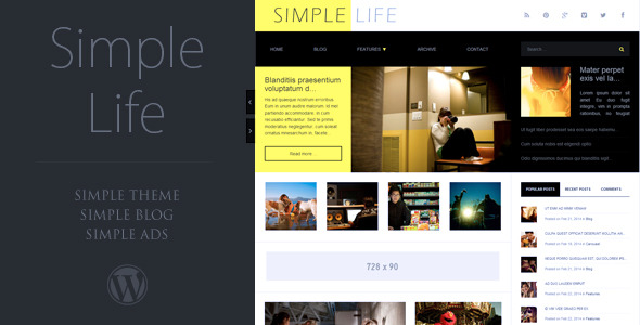
Simple Life, WordPress Theme