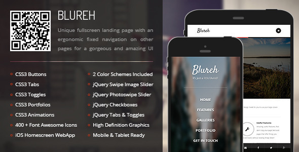


Blureh Mobile Template
Enter a website built to create the feeling of a native application. A simple, elegant, landing page with smooth animations will greet your users. Your logo at the top, and an easy thumb print size navigation will show u! To make things even better, the content page is controlled by a fixed bottom navigation which makes it completely unintrusive. Blureh is a Mobile Template and a Tablet Template offering all mobile compatibility.
Elite Author
Elite Quality Item with 7 + years experience!Elite Quality Support with 24/7 responses to tickets!Elite Quality Support with the best documentations on the market!Main Features
Mobile & Tablet ReadyPhoneGap & Cordova Compatible400 + Resizable icons by Font AwesomeCrisp, Clear, and Beautiful Fonts by Google FontsOwlCarousel Slider & Swipebox Image GalleriesCSS3 / PHP / Ajax Contact form with ValidationIncluded Pages
We’ve included all possible pages you can need, starting from the most basic to some of the advanced ones you may encounter or require!
We’ve included multiple gallery and portfolio variations for all your needs, if you’re using this a simple site template for your page or you want to highlight a gallery of products or images, we’ve got them covered!
Want more features? Here’s a list!
If you think that’s all, you’re far from the truth! We included everything your heart can desire in our mobile templates to provide you with a perfect site template for your page without compromising on features and without cutting them away.
Typography Features
Text ColumnsImage ColumnsIcon ColumnsResponsive Images with Aspect RatioResponsive Videos with Aspect RatioResponsive Maps with Aspect RatioCSS3 Multiple Heading StylesCSS3 DropcapsCSS3 HighlightsCSS3 Table CSS3 QuotesCSS3 TogglesCSS3 AccordionCSS3 TabsCSS3 Large NotificationsCSS3 Small NotificationsCSS3 FieldsCSS3 CheckboxesCSS3 RadiosCSS3 3D ButtonsCSS3 Squared ButtonsCSS3 Rounded ButtonsCSS3 Social ButtonsFontAwesome ListsjQuery Features
jQuery Page PreloadingjQuery Device DetectionjQuery + CSS3 NavigationjQuery TogglesjQuery AccordionjQuery TabsjQuery Quote SliderjQuery Staff SliderjQuery Image SlidersjQuery Share from Bottom Pop-UpjQuery Contact Form with Field ValidationDesign Features
Optimized for Touch DevicesCSS3 Based DesignSimple, beautiful, elegant Design8 Color Schemes for different elementsiOS / Android Home Icon & Splash ScreenHigh Definition / Retina GraphicsErgonomic NavigationDesigned for a intuitive User ExperienceResponsive for Tablets, for a better experienceFully scalable icons, pixel perfectOS Requirements
iOS 6+
Android 4.4+
Windows Mobile 8+
RIM 7.1+
mobile, tablet, mobile tablet, site template, mobile site template, tablet site template, phonegap, cordova, sidebar template, mobile sidebar, tablet sidebar, webapp, samsung, htc, iphone, ios, android, ipad, responsive mobile, responsive tablet, mobile navigation, mobile app style, app style template, mobile style, tablet style, mobile site, tablet site, themeforest mobile, themeforest tablet, mobile app, appstore, play store, phonegap compatbile, cordova compatible, html5, css3,
Share this